Tuesday, August 07, 2007

meanwhile . . .

I'm a bit behind here because it's been an exciting week in the world of letters.

First, Charles Simic was appointed Poet Laureate.

Second, the most delicious full blown batshit crazy scandal hit the world of blogs and you just have to read it to believe it. Only writers can do this kind of stuff to each other--and themselves. When they invite us to the party it is fun to watch the fireworks -- and the bonfire. And this is one stinking pile of vanities that is going up in flames. Read about it here.

And finally I've got some decent research work that is naturally a huge rush job so I won't be able to turn my attention to the really important matters like:
And that isn't even getting into:
  • how fabulous Amuse Biatch posts have been: each more packed with gossip and wit and innuendo than the next . . .
Although at least I was able to talk about Eric3K's new foray into the home improvement market...

before I disappear back into the series of tubes . . .

best ever home improvement posting

This is the story about a man with a dream


and very fetching bright yellow towel.


Here are the best set of instructions for a home improvement project

ever:


It provides the usually witty commentary we've all come to know and love from Eric3K:
"Why pay a plumber when you can do a thoroughly unprofessional job yourself?"
plus helpful and hilarious photographs:

don't ask why

This time Eric3K and Other Eric have decided to use their talents for good and not evil: i.e., to explain and illustrate a successful how-to project for upgrading your bathroom.


I don't want to give too much away so I've just cut out some teasers:


Just click on the helping hands.

Thursday, August 02, 2007

design star 1: the design

BEDROOMS

This is clearly the best space. It is a nice color palette. Simple, streamlined, uncluttered.
The walls are graphically interesting and three dimensional. I really like their attention to lighting (with one caveat discussed below).

It was a difficult task given how many beds they needed to get into that room.

The second room is also fine. I like the medallions on the wall.
The colors are a bit of a mish-mash but given all the problems they had working together (more on that later) it turned out better than I expected. The curtains are a very good idea in terms of privacy and light issues. A lot of the designers had a problem with over-accessorizing.

Both bedrooms have some basic practical problems with proper bedside tables and reading lights. I also would have gotten some low baskets or boxes to slide under the bed for storage of a few small items (slippers, tissue, moisterizer, book, pen, sketchbook, nightlight, sex toys, ha ha, etc.).

MAIN FLOOR

First of all, I don't think they did a space plan which was a HUGE MISTAKE.
Is that another eating area at the end of the room? I don't quite understand the layout of the space. It does seem a shame to have used up a cool hanging-out space for dining but I have to admit that it looks nice. I really don't like the lighting fixture.

This is ridiculous. Who is going to use this? It isn't private enough for meditation. It isn't comfortable enough for conversation. And the white covers will get dirty fast. This also falls into the problem of not having a space plan.

My eyes! My eyes! Those pillows are hideous.

The built organic shape is a nice start. But where was it going? Robb was mad at Josh about this but it didn't seem like Robb had any ideas himself. This shows the problem with the group not doing an overall space plan. The space is a yawning empty cavern.

Which leads to the entrance below. The entrance is an entrance. There was nothing more problematic with this space than with any other space on the main floor as it all flowed together into one big confused area.
The problem with this is 1. ugly colors. 2. ugly art. Someone needed to just say that this was going to be too trashy looking. And what they hell is the deal with "The Rats"?? That's just not nice. They are professionals. This looks like some teenager got to turn the unfinished basement into their bedroom.

The bar and stairs: that paint job is awful. Really awful. A real pro would have looked at that wall and known better than to have tried to paint it. Not replacing that hideous light fixture was a major mistake. I don't like the grey and coral palette. Black and red are rather overdone.
What is the problem with these designers and light fixtures? Sparkle and Will were the only ones who paid attention to this. That's very basic. Neerja couldn't find bar stools, didn't replace the light, didn't finish the painting. What was she doing? However, in Neerja's defense: she handled the money and budget and she did that well. We've seen what happens when someone doesn't handle that well.

We now address my two favorite contributions. And by favorite I mean the first items that I would put outside on the curb. First, the skateboard ramp. It appears to be well built. It is finished. However, it is ridiculous. No one else is going to use it. No one else looked at the space and said: "I'm going to make something that only I can use." I can't believe the judges were impressed by this. This is carpentry but how is it interior design? If this is what it takes to impress the judge then half the teenage boys in California can be on Design Star.
I will say this: the hammock is a nice idea in front of all those windows and under the palms but why did he get such a cheap one? He should have gotten a much nicer, more comfortable hammock that is easier to use. And one that is for two. But I suspect this is a dude that hasn't thought much about that sort of thing.

And last of all, and least of all, there is the hanging car door:
WTF?

The fact that Robb is still on the show and Lisa was kicked off is proof that they just want to keep someone on who will create conflict. Lisa was just too nice.

Links:

design star 1: designers

THE DESIGNERS

Let me start with the best. I had already decided last week that Josh Johnson was the reason I was going to watch Design Star. My only problem this week is that we didn't get enough of him.

Josh J ("Sparkle" -- fabulous!) and Will are going to be the ones for the win. I'm ready to just call them the winners now. They would make a fabulous show together: ebony and ivory. That is hilarious. And they are both such sweeties! It just shows you how two people with very different sensibilities can work together if they are really good designers and put the project ahead of their own egos.

Josh and Will

I really hope that Design Star focuses attention on these two. They both have very strong (in a good way) personalities. They are both very funny. And they are talented designers. What more can you ask for??

Will Smith
has a Bachelor's degree in Criminal Justice and African American and African Studies from the University of North Carolina. So Will gets a major plus in my book for having a solid well-rounded education from an excellent university. I think we will see this is a big asset for him as a designer.

Josh Johnson Fun Facts: Something you'd never guess about me: I was once a probation officer. Unusual skills: Clogging. Childhood dream: Flying Wonder Woman's invisible jet. That is a wacky combination of skills and interests!
If this doesn't work out Will and Josh can go into business as private detectives since they both have backgrounds in criminal justice. Instead of Starsky and Hutch they'd be Sparkle and Smith!

Josh & Scott
These two are my second choice after JoshJ and Will because of their previous work. They both have experience and interests that I think would be a good focus for HGTV. Josh works on Green Design and I think HGTV should do a show about this. Scott likes California ranch and that's one of my favorite styles.

Josh Foss Fun Fact: Favorite designer: Charles and Ray Eames. "My dad worked for them back in the early 1960s." That's another major plus in my book!

Kim Adrianna Lisa
I need to see what Kim and Adrianna can do but they have the personalities that would be great to host a show. Lisa seemed like she had a good personality for hosting the show. The skunk hair would have to go. (1983 called and wanted it back.) But her work was disappointing. Kim would be great because she represents the HGTV viewer. She is someone who does crafts -- who watches the shows and then does the projects that are shown on the shows. I think it would be really cool if she won because she would be proof of the DIY ethos of the network. Both Kim and Adrianna have the upbeat can-do spirit targetted at women and especially at women of color and women who may just be starting out or who don't have experience.


Neerja and Christina
AKA Miss Migraine and Miss Negativity. These two do not have the personalities to host a show. They are very grating. Neerja did not crack a smile once. She looked so tense I thought she might shatter into pieces. I have to hand it to Adriana for putting up with Christina because she was wearing down my last nerve. Christina keeps talking about her "two little ones" (and that's getting old fast) and her "no no no" attitude sounded like she had been spending a little too much time around toddlers.

todd and robb

click here

major tools

todd & robb

As irritating as Neerja and Christina were, that was nothing compared to Todd and Robb. These two are not designers. Top Design has to stop picking people like this to be on the show. It is what makes the show such an amateur hour. This is what makes the show potentially unwatchable to someone like me. Seriously. Life is too short. I have yet to hear a coherent noise emamate from them. I heard yelling, bullying and sound/words like "whoo" and "cool" and "dude".

Who is the Design Star Major Tool?


(click on images for close up of text)

Thursday, July 26, 2007

my new favorite blog


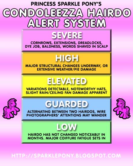
princess sparkle pony

"I keep track of Condoleezza's hairdo so you don't have to."


It's like Wonkette + Barbie + My Little Pony.

Recent posts include some great material commemorating Tammy Faye including audio from a children's album (of Bible songs and stories) that Tammy and Jim recorded in the 1970s and described in this way:
This fantastic album consists of ten songs sung in a shrieky fake little girl voice and two stories told by Jim 'n' Tammy and all their puppetland friends. The stories are my favorites, because the musical background is so off-the-wall, at points it almost sounds like Captain Beefheart is providing the accompaniment.
The Princess also scores an exclusive interview with one of John McCain's "notoriously gay sweaters":
PSP: Were you the first gay sweater on his staff?
MGS: No, there were others. There was a small coterie of gay outerwear ...
Check out the educational posts on Fashion/Beauty history such as the evolution of Harriet Miers hairdo. (Shear Genius take note.)

Want more? Hilarious photoshopping.

Sunday, July 22, 2007

design star starts tonight

And Linda Merrill at Chameleon Interiors is blogging! So we are going to get some informed commentary. She already has her first post up and it looks like the second season contestants have been given much nicer digs than last year:
Design Star vs Top Design
There were ways that I enjoyed Design Star more than Top Design. While there is no substitute for Todd Oldham (be still my heart), Clive is a fine host, and the judges lacked some of the pretentiousness of the TD judges. (That was what I liked about Todd, is his lack of pretentiousness...but he was the exception to the rule.)

The contestents on Top Design were stronger and more professional and TD had bigger budgets. However, they weren't always more imaginative than Design Star. At least with Design Star the contestants got out of those white boxes!!!

Plus the amateurism of the DS contestants made the show more amusing. Who can forget that woman who seemed like a crazy homeless person who just picked up trash on the street. I still suspect that she just wandered into the set and they let her stay for the first episode.

Note: Linda Merrill's first "sneak peak" post has a good discussion of the problems with the first season of Design Star.

Color Splash
I have to say that the biggest disappointment with Design Star was the show (Color Splash) that they created for the winner, David Bromstad. Even though David was the obvious winner and he was great on the competition show, I thought the show they created for him was unwatchable. Furthermore, I was surprised by how much he annoyed the bejesus out of me on his own show. Everyone -- but especially David -- was insanely peppy and excited about everything. It was ridiculous. There is a difference between being warm and enthusiastic and looking like a friggin' moron.

The work David did on the competition seemed a lot more innovative than what he did on the show. I think on the show he was restrained by having to use products from certain stores.Also his color palettes were rich but not interesting. Sometimes they were just dark. They seemed really traditional, especially after seeing what designers like Matt did with color on Top Design (for example -- my top ten list). The entire show was too too tooo much. It needed to be toned down a notch. Or two. Or ten.

Design Star 2
But now we have the second season:
And oh my. I just gave this a perusal and it looks like it could be fun ... perhaps even hilarious (wait for it ... below).

First of all, they have gone to central casting and found their stereotypical southern belle, aged 30, with a high school education, who has lived out her childhood dream "to marry my Prince Charming and have children."

Ain't she sweet

Judging from her interview we can expect pearls of wisdom to fall from her lips.

But

here

is

the

kicker ...

I can't believe it's not butter.

I'm speechless.

And I can't wait to watch.

visit the photoshop of horrors

First of all . . .

For those of you who haven't yet seen it, this past week Jezebel has had a fabulous series of posts entitled "Photoshop of Horrors" regarding a recent cover of Redbook magazine featuring Faith Hill. They offered 10K to anyone who could get them a copy of a pre-photoshopped image of the cover. The result created quite a buzz. I've put links to the posts below.

and yet they couldn't do anything about that hideous dress?
  1. Here's Our Winner! 'Redbook' Shatters Our 'Faith' In Well, Not Publishing, But Maybe God
  2. The Annotated Guide To Making Faith Hill 'Hot'
  3. Faith Hill's 'Redbook' Photoshop Chop: Why We're Pissed
  4. The 'Redbook' You Should Have Seen On Newsstands
  5. The Week You Gave Us 'Faith' In The Internets
In contrast to Faith Hill (who is aging beautifully and does not need the distortions of Photoshop) there are the stars who are constantly getting plastic surgery in desperate attempts to look younger. Supposedly they would need less Photoshopping but I suspect that in practice the reverse is true.

JUST ADDED: For a recent discussion of Hollywood stars and plastic surgery check out Ms. Place's new post on her Dishin Dat blog:
If nothing else it will scare you off of getting a chemical peel. Ow! Ow! Ow!

On the other hand . . .
"The Photoshopping experts at PlanetHiltron.com have done the opposite of Redbook and given some of today's biggest boldfaced names "normal" makeovers, which, according to the Daily Mail, means they've made to look like your run-of-the-mill, fashion-challenged, badly-coiffed, fat Americans." ( Keira Knightley: Just Like Us? | Jezebel.com )
Check it out. The images are hilarious:

Tori and Candy Spelling

And finally . . .

If ever we needed a warning against combining drugs and plastic surgery, Gawker brings us
Courtney Love...


Warning: do not go to this link on a full stomach. My favorite comment:

Wow, has she been working out? Look how defined her arm muscle is...oh, my bad. That's just her skin sliding off. (MISSGOLIGHTLY AT 07/13/07 06:27 PM)

Wednesday, July 18, 2007

all tim all the time

updated 07.19.07

Let's talk overexposure.

He's everywhere. Magazines, television, web. He's on red carpets. He's on Oprah. He's on Kathy Griffin introducing Paula Abdul as the greatest woman on the face of fashion. He's selling the book. He's selling the new show. He's selling the new company. He's selling cars. He's selling salad dressing for chrissakes! (WTF?)


Everything he does is breathlessly discussed and repromoted online and in talk show and infotainment interviews.

He has an opinion on everything ... and I mean everything.


(Including a few things he may want to keep to himself ... but whatever. He sounds like an expert and that's what counts... and we're only talking about women's body images here -- so no big deal, right?)

For the Gunnophiles all this is great.

For the rest of us (or maybe it's just me) . . . not so much.

I am actually not all that interested in the new Tim Gunn show. He keeps claiming his show is going to be "different" from other fashion makeover shows but I have yet to see anything that convinces me of that.

I am interested in fashion design. I liked Project Runway because it showed the creative practice of innovative new fashion designers at work. At this point, I think that Project Runway could indeed exist without Tim Gunn. Yeah Tim is great in that role but deep down inside haven't we all heard "make it work" just one too many times?

Wouldn't it be fun to see Laura Bennett's droll eyerolls and wicked "Bad Mommy" comments? And she is someone who actually knows how things work. She is someone who has serious training in the history of design as well as technique. Or what about Uncle Nick?

I'm just saying that Tim Gunn isn't totally irreplaceable. I think Bravo is making a mistake if they think that he is the reason people watch Project Runway. Call me crazy but I think the work of the designers is more interesting than the personality of Gunn or Klum or Kors.

Gunn's priorities are obviously with himself. Fair enough. I just hope that he -- with Bravo's assistance -- doesn't crush Project Runway in pursuit of them.

His makeover show may be a "lead-in" for Project Runway for some people but fashion makeover shows are a completely different genre. And they are really depressing. They ultimately end up being infantilizing and condescending. (With Tim in charge I can't imagine this will improve -- I mean he is the personification of haughty. That's partly what makes him such a hoot.)


I got hooked on watching Project Runway (and Top Design, etc) because it was creative and challenging. If I wanted to I could watch this other kind of programming on E! or Lifetime (celebrity, run-of-the-mill reality, women's daytime programming). I think that by focusing on promoting Tim as a star rather than on the actual creative work done on Project Runway Bravo is risking the very audience it gained from its innovative programming.

On the other hand, Bravo could always go in this direction (click image for link):


two questions about project runway


1. Why was it delayed? Why did they skip a season? Was it because of the Tim Gunn negotiations? Was it because they couldn't find enough good contestants?

2. Inevitably there is some energy lost by the show being off for this long in between seasons. Do you think it will be able to recover or do you think it is not going to be quite the same hit that it was by the end of the third season?