Sunday, December 10, 2006

narcissistic celebrities

from today's New York Times Magazine:

You wouldn’t be alone if reading that made you think, Well, duh! Everyone knows that. But you’d be wrong. Until recently, no one had studied celebrities to determine whether they’re truly narcissistic. Why? Because celebrities are shielded by public-relations people and managers who reject requests for things like personality questionnaires. Unless you’re Drew Pinsky, the University of Southern California psychiatry professor and host of “Loveline,” a syndicated radio talk show.

Pinsky has celebrity guests on his show who talk about their latest projects while he answers questions from teenagers about love and sex. Over the years, during commercial breaks, he and his colleague Mark Young, a professor of sports and entertainment business at U.S.C., have surveyed 200 celebrities using the Narcissistic Personality Inventory, a widely respected questionnaire that measures narcissistic tendencies and ranks individuals on a scale of 1 to 40, with 40 being “extremely narcissistic.”

Pinsky and Young found that on average, celebrities scored 17.84 — about 17 percent higher than the general public — with females ranking significantly higher than males. Interestingly, celebrities with the most skill (musicians) were the least narcissistic; those with no skill (reality-show stars) were, as Pinsky says, “off the narcissism charts.”

When Pinsky and Young published their data, people said, Whoa, celebrities love themselves— what a shocker! But in fact, that’s not the case.

“Narcissism is not about self love,” Pinsky says. “It’s a clinical trait that belies a deep sense of emptiness, low self-esteem, emotional detachment, self-loathing, extreme problems with intimacy.”

Narcissistic Celebrities, Published: December 10, 2006, By REBECCA SKLOOT, The New York Times. Click here to go to the original article.
Three remarks about the article above:

1. Isn't it nice when scientists decree that something blatantly obvious can now be called true because they have tested it in a scientific study, as if there is no other form of knowledge? On the other hand, I also think these studies are fascinating and I think they are important because they can just as often challenge commonplace ideas we take for granted as true.

2. The study may have something to say about the difference between the contestants who have more or less skills than the others. Or the ones that are more or less insecure about their skills.

3. Everyone on that show has a desire to be a celebrity, which signals their likelihood of being narcissistic. By definition the show is going to attract people acting out various symptoms of their "deep sense of emptiness, low self-esteem, emotional detachment, self-loathing, extreme problems with intimacy." Ladies and gentlemen, I give you: Keith, Vincent, Jeffrey.

My point is that they don't need to select the most obviously narcissistic of the applicants -- the ones who are at some level ugly and sad. Project Runway is going to end up with a group of people who are good at attracting attention to themselves. Why not pick the ones who do it through humor? As well as talent, of course. That's a given.


Sunday, December 03, 2006

name change announcement

Since August '06 this site has been devoted to Project Runway. As of December '06 I've decided to nclude more general discussions of popular culture. Keeping with my theme, I'm calling extra-curricular. I'll still be talking about runway and fashion -- perhaps more of it will be in the area of fashion history -- but until another season starts there isn't enough project runway material to interest me. I'll be talking about the new design show. And whatever.

Tuesday, November 28, 2006

shameless commerce

Okay, I am a bit ashamed of myself for these commercial postings, but . . .

for the record:

  • the markup on the coffee mug is a whopping one dollar
  • everything is being offered at the lowest profit level price
  • you can also purchase t-shirts that benefit the NOLA SPCA
and while I'm on the subject:
  • you'll notice the only other ad I have is for Powell's Bookstore which is an independent bookstore in Portland Oregan that offers both new and used books. If you have never been there it is worth a trip to Portland just to spend a weekend at the store. It is the size of an entire city block.Of course, if you buy a book through my web page I get a small percentage but it doesn't add anything to the cost of the book and you can feel good about supporting both an independent bookstore and an independent writer!
which is to say:
I'm not exploiting you to get rich, my friends. If I earn twenty five bucks out of this whole endeavor after a year I'll consider myself lucky!

Monday, November 27, 2006

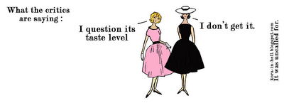
fashion critics mug

More shameless commerce.
Start your day with a bit of bitchery!

Once you've made it through your morning cup of coffee with these fashionistas you'll be ready for anything.


They don't know much but they know what they don't like and they aren't afraid to tell you.

To purchase this mug (for $12 -- bargain level for online printing sellers) click here or on the images above or go to the kora in hell main storefront at www.cafepress.com/korainhell.

open for business

I have actually been working on Uli and Michael's safari theme but I started meandering into Saint-Laurent and Clark Gable and Hemingway and then I started thinking about hunting and that lead to wearing furs and then I got really depressed so even though I will get that safari piece posted one of these days I decided to do a form of retail therapy and create a shop and so . . . .


Monday, November 13, 2006

uli's collection

NOTE: FOR SOME REASON ALL OF THE IMAGES DISAPPEARED FROM THIS POST. AN INVESTIGATION IS UNDERWAY. - 11/28/06

This is the last of the reviews of the final collections. I've already reviewed Michael's, Laura's and Jeffrey's collections.

My next post will discuss Michael and Uli's collections as part of a more general discussion of the idea of "safari" in fashion. I talk a bit about this below so I'm hoping that post will be blessedly short.

the collection


Although Michael and Uli's collections are very different, they have a structural similarity: both have a neutral base highlighted by four colorful pieces. Uli's colors are rich tones but they have a more muted and earthy feel to them whereas Michael goes for brighter bursts in more saturated hues.

Uli's collection provides some sportswear and evening wear, but the overall conception is for resort. I've broken the collection down into two sections based on the fabric differences -- the silver and leather, and the flowing silk chiffon fabrics.

group 1

This group was a surprise from Uli; indeed it seems like it was a jaw dropper for a lot of the audience. This was Uli's firm assertion that she could make the full range of garments needed for a collection and that she was no slouch when it came to working with neutral colors, different fabrics, and sportswear fashions.


I'm not a big fan of all the silver sparkle but I prefer it to the gold. The thing I like best about all of this sparkly fabric is that I think of it as the fairy dust that Kayne sprinkled on people when he left. The silver material would have been okay except for the third and fourth outfits. They are too much. I would have liked for those to have been a mix of the dark brown and the tan.

The first two pieces (above) are very sophisticated. The last look appears to be too clingy. The fourth dress looks like something you wear when you get out of the shower. The neutral color of the slip underneath reminds me of suntan pantyhose.

I think Uli's shorts are the best by far of all of the shorts in the collections. It would have been nice to have had pants in this style as well. And as I said before, just one or two more pieces in this darker brown fabric might have provided a little more interest in the first half of the collection.

I really wish there had been a picture of the jacket.

I don't know why the tank top is so loose -- how would you wear it? Over a bathing suit I suppose.

I don't know about all this 0-ring motif. It looks like a stylistic mix of s&m and the engineering lab.

group 2

This group represents the fashions we expected from Uli. She gave us what we wanted at the same time that she surprised us with the unexpected.

She did edit herself and we didn't see the rows of gypsy ruffles. Thank god. It is hard enough to wear prints when you are short (like me) but layers of gypsy ruffles -- forget it.

Each garment only used one print and two of her dresses used the same, neutral, animal stripe fabric: Uli was really holding back!!! The two tiger stripe dresses provide continuity in the collection and she could have ended the show with the longer dress, coming full circle since she started with the shorter dress.

I think that collar of the short dress is fantastic. The top of the long dress is pretty on the model but I'm not a big fan of that style. How wearable is it really? I wish that we saw more of that purple/brown fabric that peeks out underneath. It looks beautiful. I wish she'd used more of that instead of the suntan pantyhose slip fabric.

I should note that all of the dresses use shells and other natural materials as embellishments or as fasteners or other elements of the design. They function as jewellery and the effect is stunning.


I think the added length to the blue dress (above) is great and the back is fabulous. However I like both necklines and I think it would have been nice to have had both versions in her collection.

Unfortunately the model (above left) is a disaster for this dress: she has a dreadful slouch. As a result of this bad posture her shoulders are hunched forward and her chest is caved in. Added to this her hair styling is a mess. The overall effect practically ruins the look of the dress. This is the one exception to an otherwise fabulous group of models.

It is a shame that this dress did not stand out better not just because it is a beautiful piece but because this blue color is so important to a collection with an African theme. Of course the blue color is so often associated with the Blue Nile. But more importantly a number of African cultures are known for their different indigo textiles and the various forms of weaving, dying, and wax transfer techniques that have been developed over many centuries. African fashion -- both traditional and modern -- often uses this kind of blue fabric:

Note: the images above are from an online magazine www.africa-ata.org, which has a section on fashion, including fashion shows from around Africa.
Continuing on this note, a sampling of African fabrics (below) demonstrates Uli's understanding of the safari theme as having a color palette that is about more than just animal prints.

That is, the "safari" reference to Africa includes imagery of landscapes and seasons (among other things). A few dresses cannot demonstrate the full range but Uli's skill with print and color gestures towards a broader and more complex vision of the continent.

Changing topics (sorry I can't come up with a transition here): it appeared that Uli's coverup and bikini impressed the audience more than any other outfit. Of course it is always hard to know if this was in part due to the striptease factor. Everyone had to get a little bit of a kick from this reveal:

You have to have the perfect model to pull that off. So to speak.

The fact that the bikini top is part of the dress was a great design feature: it is so much more elegant than other forms of "cover ups." It turns poolside fashion into evening wear!

I can imagine this being the style hit of the season. No wonder Uli was being swamped with orders for her designs at the end of the show. Every resort shop in the world is going to want to carry these in a myriad of sizes and fabrics. I think this is quite the style innovation.

Refreshingly, there is nothing retro about it. In fact it is a look that depends upon the latest technological advances in fast-drying fabrics.

Finally I want to talk about my two favorite pieces:

The first dress is my favorite. The detailing around the collar is exquisite. It is, in many respects a more elegant dress than the final one. The gold and plum layers move lightly which balances the more substantial top of the garment. (Nazri's dress is the opposite, lighter on top and with more fabric on the bottom half.) I like the long sleeves. First of all because even tropical places can get cool during the evening. Secondly, I cannot be in the sun for more than ten minutes without risking sunstroke and second degree burns so I need the full length coverage. But practical matters aside, I think that dress is beautiful. Just beautiful. That's all.

Although I have suggested in places above that variousother dresses could have been the final gown it is easy to see why Uli concluded with the onw she did. It is the signature Uli style. She had to remind us of why she was there and what it was that she does better than anyone else.

Nazri

Nazri looks great in everything but the flowing layers of that gown demonstrated how she can really work the runway; in a sense Nazri has a kind of effortless grace that is similar to Uli's. She doesn't have to call attention to it and she makes it look easy. I'm also pleased that Nazri got to wear this gown and not the one that Michael made. It was the best gown for Nazri. Uli/Nazri should have won. They didn't. But at least Nazri got to go out in style.

Where did Uli go wrong?

I'm convinced that a key reason why Uli didn't win a number of the challenges, as well as the final challenge is the fact that her work is so effortless and she herself is so understated. Her talent is taken for granted.

Here are three things that Uli should have done to have improved her chances of winning:

1. be more shamelessly self-promoting

There was no attention paid to the difficult labor put into her collection. All of the detailing -- the shells and bone embellishments -- were labor-intensive. Uli, typically, didn't call attention to this. Big mistake. She needed to tell people about how hard she worked. Otherwise they might think that she didn't have her stuff finished and had to send things out to in order to get done on time.

During the season she should have talked more about how she already had a successful business and that lots of famous people wear her clothes. She could have gotten into a celebrity client show-down with Jeffrey. In her interviews she did not talk about how when it comes to working with prints all of the other designers suck. She really dropped the ball when it came to being a blow-hard.

Not for nothing but when it comes to hard luck stories -- she could have milked that East German childhood. That was a missed opportunity. I think she would have given Jeffrey's sob story a run for his money. In addition, perhaps she could have adopted a child from Africa to prove that she was capable of having affection for the young.

2. be more immature in her designs

Uli was the only one who created sophisticated looks for the office. Laura's clothes are evening wear.We all know the profession Michael was designing for! (Actually that isn't entirely true -- but even the ones that aren't trampy are too leisure - styled.) Jeffrey's clothes are too young. His clothes are for school, or a job at Starbucks. Fashion worships at the altar of youth. Clothing that one can wear to a real job is now considered too "mature."

3. be more unappealing in her designs

Clothing that is attentive to women's bodies and to what women like to wear is too appealing and so it can't be hip.

If women like something it means that it isn't fashion forward. The most radical designers are the ones who don't pay attention to women's bodies or what they look good in or what they want to wear. Because, you know, women are stupid.

Finally,

In the end, after looking at Uli's collection again, in detail, I have to say that it seems clear to me that she deserved to win. It was the glaringly obvious choice. At the same time it comes as no surprise that she didn't. Given the way things went during season three we should all just feel grateful that Vincent didn't win.

Thursday, November 09, 2006

michael's collection

Okay, let me just say from the start: I would not wear these clothes even if I had the life that required a resort component to my wardrobe. I am not a clubber or streetwalker. And I have never used "izzle" as a suffix. All of this means that I am completely unqualified to comment on this collection but that has never stopped me before so why should it stop me now?

the collection
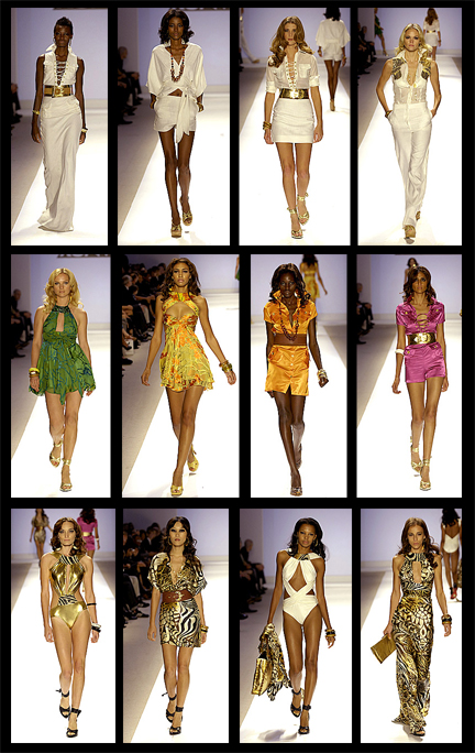
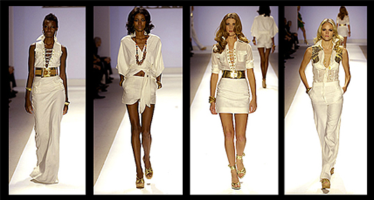
There are two things I notice when I look at the collection together. The first is that it is really very well conceived as a whole. It starts with crisp whites with gold accents --a classic for resort wear -- and if it is white linen it would be a good choice for the safari idea. Then he does something surprising but not too jarring which is to put in a group of jewel tones. These establish the tropical setting. Then we return to the gold and white adding animal prints for his safari theme.

I now understand why Tim always felt that, despite its problems, in the end the collection came together in its way. I think it demonstrates that Michael can put together a complete working collection. In a way it is the most complete wardrobe compared to the others.

It sounds great, doesn't it? The problem is that it It falls apart at the level of taste.

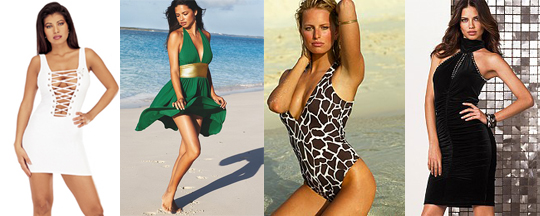
Which brings me to my second observation. The clothes look like they are from the Victoria's Secret catalogue.

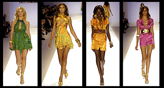
Fun fact: the color of the green dress is called "jungle."
Look at all the positions from which they're asserting their empowerment.


This comes from a well-meaning place, I swear. He is young. He will learn. But basically I think the sensibility of the collection is just immature. I know he wanted his collection to reflect an assertion of a strong woman. Isn't that sweet? Problem is, he didn't seem to know what that might look like. He said some stuff about urban safari and asserting herself and searching for herself and being modern and whatever. But he's actually created a look for the woman on the prowl.

It is a common mistake.

first row : #1-4

I don't have anything much to say about this other than to confess that I never buy white pants or skirts because it is a law of nature that within 24 hours I will spill coffee on it. I like the second look above. The other looks might be okay if you got rid of all the sparkles. But some people like that sort of thing. Some people also like to wear sweaters festooned with sequins at the holidays.

second row : #5-8


First of all. That first model is only a size six at most. And she is tall. Six is not a large size. Especially for a tall women. But that dress makes her look like friggin' cow!! The problem is not the model. It is the dress. This is unfortunate because I really like the fabric.

The best look in the collection is this second dress:

I want this dress and the breasts that go with it.

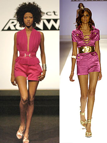
After this the collection starts to plummet. The next two looks introduce the Really Shiny Fabric. The glare affects everything: it is all seen through a sheen of sleaze. The pink outfit looks like the kind of thing that is worn by the drunk girl outside the club after it has closed. The one whose friends left without her while she was making out in the parking lot. By now she has lost the belt and the shorts are stuck to her thong or maybe she's lost that too. Anyway, just compare that outfit to the look Nazri wore for the icon challenge:

Oh, Michael. What happened??!!

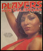
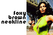
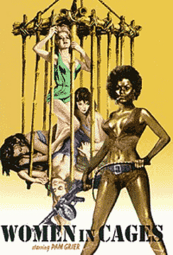
We have now reached the point where I have to start talking about Pam-Mutha-Fuckin-Grier, or PMFG. I think it is fair to say that PMFG is one of Michael's main muses.


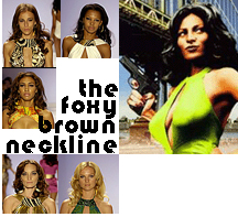
And for good reason. There are 70s fashion icons that have stood the test of time and Pam Grier is one of them. Cher: of course. Farrah: not so much. Anyhoo, I can understand why Pam Grier would be a fashion icon seeing as she's da bomb and what not. I will discuss this a bit more below but right now I'll just point out that I noticed Michael repeating something I decided to call "the foxy brown neckline":

A fondness for the seventies look has possessed a large portion of the fashion world. I don't really understand why other than the possibility that people just ran out of ideas.

third row : #9-12

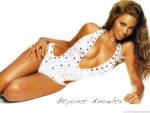
There is just no excuse for that first bathing suit. That is a lapse in taste of truly monstrous proportions. The white bathing suit is something Beyoncé might wear --

-- if you added a few rhinestones. But even Beyoncé might find the gold lamé too flashy. Maybe Li'l Kim.

Oh and there are two animal print dresses in this last group and neither of them interest me very much (too shiny, too swinger) even though these are the items that make the statement about this "strong woman" being on a safari. (I'm going to talk more about this whole safari thing after I review about Uli's collection .)

For the record: I count 5 foxy brown necklines in the collection.
Laura had 5 plunging v-necks in her collection. Yet no one noticed that Michael used the same neckline 5 times in his. I'm just saying.

pmfg & hip hop pop stars
A few comments on why this collection may have gotten a little too trashy. Or, I'm entitled to my wrong opinions. Actually isn't really about Michael. It is more about how my mind has wandered into why everyone is so fascinated with the fashions of the seventies and hip hop / pop starlets.

1. I'm not saying anything against PMFG. By all means she should stay as the brightest star in Michael Knight's constellation. I'm just saying that, although Shaft is a rollicking good time, let's not get carried away: it is not the African American Citizen Kane and while there are far too few of them in film, there may be a few African American women who are da bomb who do not come from the films of Quentin Tarrantino / blaxploitation, i.e., it might be possible to be an iconic black woman and not pack heat.

Ya think?

2. What do I know from hip hop. The last time I knew anything it was called rap and it had something to do with fighting the power and not so much with the benjamins. So I'm a total fogey. However, I recently had a revelation when I saw Dave Chappelle's Block Party (a great concert film -- perhaps the best -- don't get me started) but I suspect that when people talk about hip hop that is not what they are referring to -- at least in spirit.

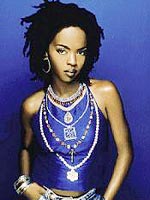
Anyway, regarding this little epiphany. Epiphanette. Really it is just a statement of the obvious but I'm going to point it out because Project Runway does show how the fashion world dresses the Entertainment Tonight / Weekly world of celebrities and pop stars. They may make good mannequins / customers but in terms of being muses for a fashion designer they are just not worth the stretch jersey that is barely covering them. Especially when you compare them to someone like Lauryn Hill. Have you forgotten? She is gorgeous. Gor-geous. And she has . . . what is that thing called? Oh yeah.

A brain.
3. My final observation is more of a 'what if.'

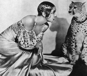
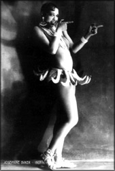
Given that Josephine Baker is a fashion icon associated with the exotic, what if Michael had looked at her for additional inspiration?
For more information on Josephine Baker check out my previous postings:

This might have brought another dimension into the collection, and perhaps pulled Michael away from the sleaze into a more elegant fashion idiom.


I'm talking about her gowns not her banana skirt, of course.


I hate to be a buzzkill but when you look some of the images it does beg the question of how far stereotypes of black women's sexuality progressed from Josephine Baker to Pam Grier.


Monday, November 06, 2006

laura : odds and ends

1. minor matters: I've added the image links and I've corrected the errors in my previous laura posts. I'm sure I've missed some. I find it difficult to edit myself in these little blogspot boxes. That's my excuse and I'm sticking to it.

2. ladies who lounge: I added some images to the first laura post (click here) -- discussing her lounge wear looks. I'm not sure she would approve however.


And finally here are a few more comments that I want to make before moving on -- in order to clarify or correct myself or just because it popped into my head.

3. forgetting the feathers: Well I must have a door in the back of my head because I wrote that I didn't like the feathers thus completely forgetting that I had created an Entire Multi-Genre Section about the feathers with the actual word feathers in the friggin' title! So let me rephrase myself.

If I were to think of the collection strictly in practical terms of fashion (which would be very unimaginative of me) then the feathers on some of the dresses are too theatrical for me. Because, you know, all the other outfits fit perfectly into my west coast lifestyle: it is just the feathers that are holding me back.

Then I remembered --
As an aside, Spanish -- that beautiful, literary, poetic, absurdist and (in this country) terribly malaigned language -- has the most wonderful reflexive construction for the verb to forget: it forgot itself to me. So that's my story and I'm sticking to it.
-- that Laura's collection also has another lineage -- one that is theatrical: the jazz age and Josephine Baker. Runway shows are theatrical productions afterall. The evocations of a classic icons of fashion such as the flappers and Josephine Baker also recalls the early twentieth century stage shows, such as those at the Folies Bergere, which would not have been complete without a full festoon of feathers. (Click here to read all of my posts on modernist fashion history.)

4. new age judges It seem strange to me that the judges would consider the flapper look matronly because if there is one thing that the flapper represents it is youth. I simply cannot see how their logic operates: a flapper is matronly but an apron dress is punk and hip? Sure. a flapper style is from the past but so are fashions from the seventies and eighties. Why is a flapper dress more matronly than a bubble skirt?

5. variety show I want to talk a bit about what is meant by "variety." Yes, Laura's looks were all evening wear. But this is said as if this means it is a single look. As if this is a narrow category. Day wear is large. Evening is small. Whenever I see these categories and assumptions I have to push against them. It's in my nature. I'm ornery that way.

Perhaps Laura's collection demonstrated that within the category of evening wear there is a great deal of variety. Laura's runway show included looks from the cocktail party and the supper club and the red carpet and the state dinner and the stage show and the box seat and the intimate dinner and the dance floor and, of course, from the bedroom. In short, she had a look for all of the elegant places of the evening.

I'm not saying that Laura had the most variety. (I haven't finished my reviews so I can't make any general statements yet.) However I am questioning whether she had so much less variety in her collection than someone who had mainly streetwear, a swim suit and one fancy party dress?

The answer to that question depends on how you define variety. The judges defined it very narrowly. Personally I think it is more interesting to challenge status quo definitions -- it opens up new ways of thinking about fashion and design. And isn't that the whole point?

Thursday, November 02, 2006

laura's v-spot

vionnet + valentino
note: I'm still making corrections. sorry about the mess.

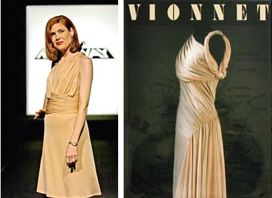
My previous post focused on the specific pieces in Laura's runway show. (Click here to go to the first post.) In this post I'm going to discuss how Laura's style relates to two important fashion designers: Madeline Vionnet and Valentino. By the way, I don't discuss Laura and fashion history because I think she is derivitive or imitative. I talk about Laura and fashion history because she is better informed -- in terms of both style and technique. This knowledge makes her work more interesting (and her imagination less limited) compared to the other designers.
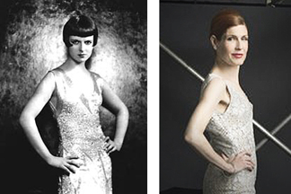
Note: I have already discussed Laura's runway show in terms of the flapper look and early twentieth century fashion designers, specifically Paul Poiret. If you want to look at these posts go to:
early 20th century fashion history :

1. vionnet

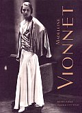
Madeline Vionnet (1876-1975) ) is the designer known as the "queen of the bias cut." She began work as a seamstress at age eleven and apprenticed for fashion designers Jacques Doucet. She had her own fashion house and a boutique in Paris during the 1920s and 1930s, retiring in 1939.

She is admired for her distinctive draping technique and her innovative bias cut designs. Working primarily with chiffon, silk, and crepe, her designs allowed for greater stretch which provided greater comfort while moving fashion towards a greater fluidity of line and an emphasisis on the woman's body.


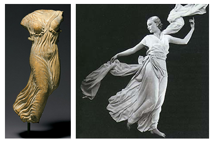
Madeline Vionnet was particularly inspired by the style of ancient Greece and the way that fabric draped on Greek statues:

Above left: Metropolitan Museum of Art, New York, From the permanent collection. Statuette of Nike (personification of victory), late 5th century B.C.
Above right: Metropolitan Museum of Art, New York. From the exhibit "Goddess"; Crepe dress by Vionnet. Vogue, November 15, 1931.George Hoyningen-Heune, Condé Nast Publications Inc.

Note: click here to go to my previous discussion of the role of ancient Greek art in how early twentieth century fashion reconceived the shape of the body.
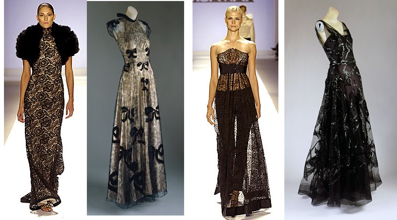
Not all of Vionnet's garments were simple draped chiffon. She also used lace, velvet, net, applique, beading and sequins to make some of the most elegant and even extravagant dresses of her time.

Above images, left to right: 1. Laura Bennett. 2. Evening gown, 1939. Madeleine Vionnet Pale pink lamé and black silk lace appliquéd with black silk velvet. Metropolitan Museum of Art Costume Institute. 3. Laura Bennett. 4. Evening Dress, 1938 Madeleine Vionnet. Black silk satin and black silk net embroidered with black sequins. From the special exhibition: Blythe Spirit: The Windsor Set: November 1, 2002–February 9, 2003.
Madeline Vionnet is one of the most admired fashion designers and yet she is also the most elusive. She disliked public appearances. She thought attention should be focused on her work, not herself. She was particularly contemptuous of the faddishness of the contemporary fashion world where styles went in and out of fashion from season to season:
"Insofar as one can talk of a Vionnet school, it comes mostly from my having been an enemy if fashion. There is something superficial and volatile about the seasonal and elusive whims of fashion which offends my sense of beauty."
a couple of recommended books:


Madeline Vionnet by Betty Kirke


2. valentino
= a fashion house started by Valentino Garavani (1932 - )

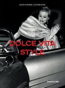
Biographical information: At age 17 Valentino Garavani moved to Paris from his town in northern Italy and began his apprenticeship with Jean Desses and Guy Laroche. In 1959 he opened his first fashion house in Rome. One year later he teamed up with Giancarlo Giammetti who is the commercial manager of the house of Valentino. Valentino is an immediate sensation: he is the designer for the world of La Dolce Vita.


In 1968 he designs the wedding dress for Jacqueline Kennedy's marriage to Aristote Onassis catpulting him into the fashion stratosphere. Between then and now he has won every award possible and it is hard to argue that he is not Italy's greatest living designer. Valentino now has a broad fashion empire but the House of Valentino designs one thing: evening gowns. In that he is preeminent. I don't think any designer has more dresses, new or vintage, on the red carpet than Valentino.

A couple ideas for an advertising campaign for vintage Valentino:

Vintage Valentino:
A dress so memorable that they may even forget that the woman wearing it was a blithering idiot.
. . .
Vintage Valentino:
After the love is gone, the dress remains.

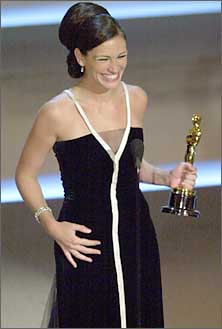
Valentino has also been known to admonish stars for going out into public looking sloppy -- if not sleazy. He believes that stars have an obligation to their public to be glamorous:
Italian fashion designer Valentino Garavani slammed Julia Roberts and Cameron Diaz for their fashion style, claiming they look like 'homeless bag ladies' compared with Hollywood stars from the past.

Valentino, 73, who dresses famous actresses like Gwyneth Paltrow and is often seen on the red carpet with her, declared that celebrities today should always look glamorous, not only when they are invited to parties or award shows.

The designer told German newspaper Die Ziet: "Today you see Julia Roberts and Cameron Diaz running around looking unkempt in jogging trousers, they look like bag ladies, like homeless people. In the past, actresses had to commit in their contracts to appear in public like stars when they left their homes.

Given that Laura does not own a pair of jeans, what could be more Laura than that?

In addition to sharing the belief that glamour is not merely a fashion choice but an obligation, dammit!!Laura also shares Valentino's classicism. In a certain way (a perverse way, granted) there is a frugality to that idea of elegance in that it isn't faddish: if you are going to buy then make sure it is something that is going to be worn for the rest of your life.

When Heidi said that Laura's dresses are the kind that a woman has in her closet for the rest of her life she could not be making a statement that said more about how Laura takes her fashion cues from a designer such as Valentino.

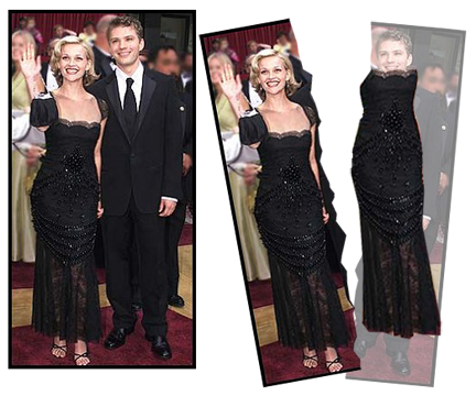
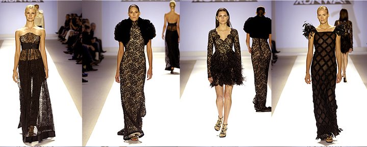
But that doesn't make Laura completely imitative of Valentino as a designer. If you look at the two rows of dresses below what is most remarkable is that they seem so similar and yet each piece is completely different. Laura's pieces were evocative but not derivative.


a couple of recommended books:


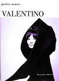
Fashion Memoir: Valentino


3. vamp??

Did this dress remind anyone else of Morticia Addams?? (For the record, I consider the comparison to be a complimentof the highest order.)

It just seems like the perfect dress for the woman who would say:
"I'm just like every modern woman trying to have it all. A loving husband, a family. I only wish I had more time to see out the dark forces and join their hellish crusade. " (What a great line. All hail Paul Rudnick.)
You also have to appreciate the irony that it was Laura and not Jeffrey who sent the best goth look down the runway.

And forget the bikinis and babydoll looks: that dress' back with its slinky fishtail swish provided the sexiest look in all four shows.

Wednesday, November 01, 2006

laura's collection

This post is just about the clothes themselves. In the following post (click here) I will discuss her work in a broader sense fashion history and the contemporary fashion world.

the collection
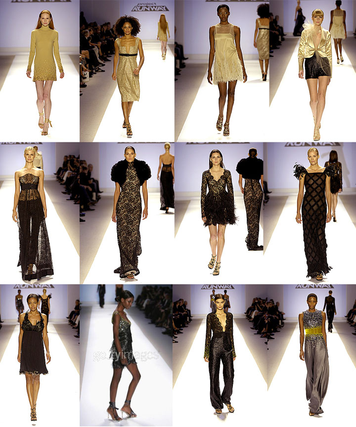
Here are the 12 pieces, in order of presentation:


The first thing that strikes me is the sense of balance and completion. There seems to be nothing missing, nothing out of place, and it is all of a piece. What it lacks in variety it gains in in coherence. The order of the pieces, the styling, the shoes, and the selection of the models, is exactly the right choice.

For some the fact that nothing is left to chance indicates a lack of artistic spirit. But I'm not so sure, especially for designers at the early stages of their careers. It is like the beginning artist who doesn't know the basics but throws paint at a canvas and calls it avant garde. (Echoes of Vincent.) Serious artists know what the traditions and conventions are before they challenge them. Serious designers must also be accomplished in creating work in traditional forms before they can deconstruct them. (Or send them out for someone else to sew.) Just saying that you don't do something because you are an artist not a craftsman (or seamstress or patternmaker) is, to my way of thinking, bullshit.

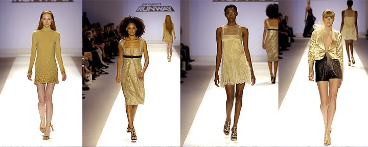
top row, pieces 1-4


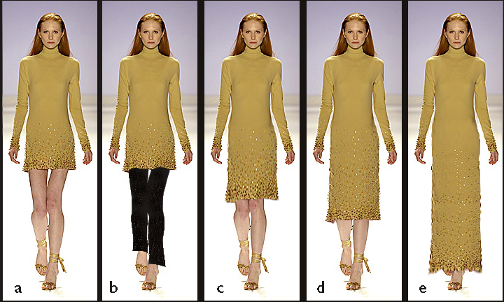
I am not the first to comment on the "wow" factor of Laura's first dress (far left above and below). It was unexpected in color, neckline, sleeves, but it was still a quintessentially Laura dress. The model even had red hair, which was a very sly way of opening the show with an assertion of Lauras "signature" in a fresh new look. This dress is sort of Donna Karan with a bit more glamour. Or at least more sparkle.


Laura may not approve of the variations (above) but I wanted to see how they might look. I think this dress also proves the lie to the idea that her pieces are not versatile. It seems such a shame Laura didn't win if only because this dress strikes me as the quintessential INC garment. It's a missed opportunity for Macy's. (But I'm from Chicago so I'm boycotting Macy's but THAT is a matter for a full-blown rant.)

If there is one choice I'd consider changing with the models it would be the second and third: The second model is short and the third is tall and I think it might be better for the length of the dresses if they switched:

(I know my photoshopping is bad but I'm trying to get this post up as soon as possible so work with me people!)
The second dress does look nice short but I think it would be gorgeous at full length, as a ball gown. It would make a fabulous red carpet gown (above, far right -- a very rough paste-up.) Normally I don't like the deep V-neck but I particularly like the neckline of this dress (below, left). This notch has more coverage and the geometry is interesting.

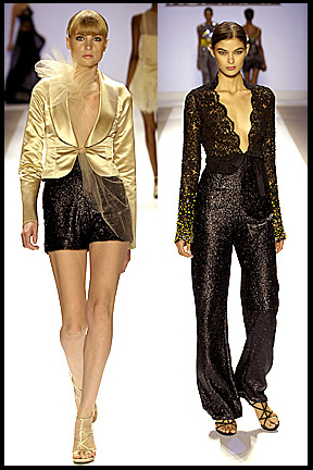
I like the individual pieces of the fourth outfit: the jacket and the shorts (above, right) but I think this would have looked better with satin lounge pants in the cream/gold to match the top. I like the individual pieces of the fourth outfit: the jacket and the shorts (above, right) but I think this would have looked better with satin lounge pants in the cream/gold to match the top (See below).
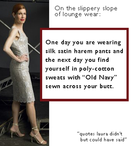
There's really nothing wrong with this outfit but I just personally would want to have the pants. I think, however, Laura might see them as part of that slippery slide into sweats: you know, one day you are in silk satin harem pants and the next day you are in cotton sweats with Old Navy sewn across your butt.

The shorts do work with the collection as a whole. First, they provide a transition from the light to the dark section of the collection. It was probably important that Laura demonstrated a certain variety of types of items. Also there was a certain mix and match aspect to her pieces and particularly the shorts and pants below.


Note: I have no idea what the foofy stuff is doing on the jacket. (I'm suddenly blanking on what that is called.) It doesn't really bother me as much as it did some because it seems like the kind of thing that is put on for the runway and isn't really part of the design.

second row: pieces 5-8

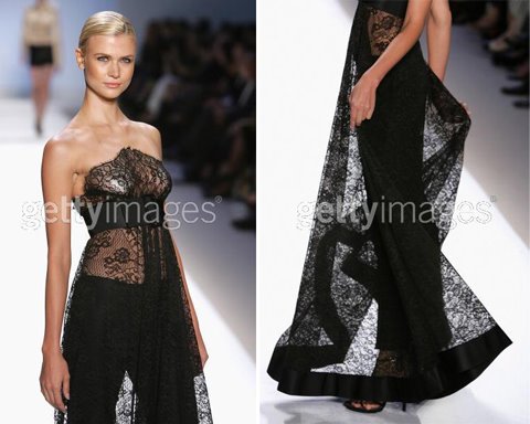
This is makes a nice series together. It is Victorian with the black lace but also playful and sexy.

In addition to the lounge wear above also liked Laura's new take on the look (below) with the skinny pants and sheer lace curtain wrap (below). This piece has that architecural quality that I like in Laura's work. It may be a bit "Victoria's Secret" but I think that there is often a little wink in Laura's clothes. This also reminds me of Keith's story on the first challenge about how his dress showed how a woman can go out to a party wearing a curtain. Laura showed how a woman can use a curtain to outfit herself for an at-home affair. She selected the perfectly statuesque model to wear it.

Now that is an Empire State.

I think that Laura selected the best models for her dresses. She just has an eye for detail in every way. You see the sloppyness of someone like Jeffrey in those sorts of things. Some of his models were completely inappropriate for his clothes.

I'm going to discuss the second dress more tomorrow so all I'll say now is that I'm happy the shrug wasn't fur. That is a deal breaker for me I'm afraid. Frankly I'm not happy about the feathers either -- from a humane and a fashion point of view. I tried to imagine what it might look like with different sleeves because it truly is a beautiful dress. I am not sure that either of the versions I came up with are the solution. The feathers clearly balanced the proportions: ence you take them away you can see why they were needed. But I still don't like them. (Also the dress is so sheer you can see her underpants.) I like this dress but I think it isn't there yet. Perhaps because the fabric reminds me of scaffolding -- I think she could push the architecture of the form further.


third row, pieces 9-12

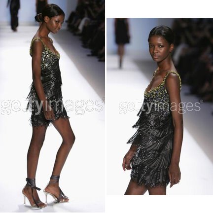
As we get to the end of the show we have a couple of black/silver flapper dresses that bring us back to the first dresses. This flapper dress (below) has that detailed work of beading -- thick on the top with some gold flash is a dress that could easily be a final piece itself. It is interesting that Laura waits until near the end before bringing out what the judges have come to think of as the classic "Laura" dress.


The movement of the ribbons on the shoes is also wonderful enhancement to the look -- which is something I noticed throughout the show.

The final gown (below) is a gun metal satin gown with thick beading on the top. The front is high and the back is open (I think of it as a swimmer's racing suit style) and intersected with a gold velvet belt. I thought the effect was stunning. And of course there was no model better suited for this dress than Camilla who has come to embody the cool sophistication and elegance of Laura's style.
The gold belt brings us full circle -- literally and figuratively to the first dress which has the beading on the bottom half instead of the top. Look below at the first and last dresses:


It is like a sun and moon. The symmetry is quite stunning.

Throughout the show there is a sensuality of movement and a play of light and dark created by the fabric choices, the cut, and the beading and other details.

It is a collection that also seems to be symbolic -- bird feathers, lace flowers -- of femininity without being too obvious or stereotypical. I'm not saying this is about some trite narrative about fecundity and birth. I think that might provoke morning sickness in Laura. I just think it is a very sexy and feminine collection that is about a woman being sexy and feminine.

I know I'm waxing bit rhapsodic but the more closely I contemplated these works the more I started to see the collection as moving more towards the world of art in its aesthetic: not just because each piece is so finely wrought but because when brought together they create something that is greater than its parts.