the collection
Here are the 12 pieces, in order of presentation:

The first thing that strikes me is the sense of balance and completion. There seems to be nothing missing, nothing out of place, and it is all of a piece. What it lacks in variety it gains in in coherence. The order of the pieces, the styling, the shoes, and the selection of the models, is exactly the right choice.
For some the fact that nothing is left to chance indicates a lack of artistic spirit. But I'm not so sure, especially for designers at the early stages of their careers. It is like the beginning artist who doesn't know the basics but throws paint at a canvas and calls it avant garde. (Echoes of Vincent.) Serious artists know what the traditions and conventions are before they challenge them. Serious designers must also be accomplished in creating work in traditional forms before they can deconstruct them. (Or send them out for someone else to sew.) Just saying that you don't do something because you are an artist not a craftsman (or seamstress or patternmaker) is, to my way of thinking, bullshit.
top row, pieces 1-4

I am not the first to comment on the "wow" factor of Laura's first dress (far left above and below). It was unexpected in color, neckline, sleeves, but it was still a quintessentially Laura dress. The model even had red hair, which was a very sly way of opening the show with an assertion of Lauras "signature" in a fresh new look. This dress is sort of Donna Karan with a bit more glamour. Or at least more sparkle.

Laura may not approve of the variations (above) but I wanted to see how they might look. I think this dress also proves the lie to the idea that her pieces are not versatile. It seems such a shame Laura didn't win if only because this dress strikes me as the quintessential INC garment. It's a missed opportunity for Macy's. (But I'm from Chicago so I'm boycotting Macy's but THAT is a matter for a full-blown rant.)
If there is one choice I'd consider changing with the models it would be the second and third: The second model is short and the third is tall and I think it might be better for the length of the dresses if they switched:
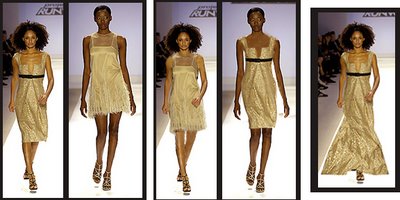
(I know my photoshopping is bad but I'm trying to get this post up as soon as possible so work with me people!)The second dress does look nice short but I think it would be gorgeous at full length, as a ball gown. It would make a fabulous red carpet gown (above, far right -- a very rough paste-up.) Normally I don't like the deep V-neck but I particularly like the neckline of this dress (below, left). This notch has more coverage and the geometry is interesting.
 I like the individual pieces of the fourth outfit: the jacket and the shorts (above, right) but I think this would have looked better with satin lounge pants in the cream/gold to match the top. I like the individual pieces of the fourth outfit: the jacket and the shorts (above, right) but I think this would have looked better with satin lounge pants in the cream/gold to match the top (See below).
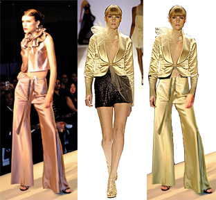
The image on the far left is from Malan Breton's runway show. (Click here to go to a discussion of the history of this type of lounge wear look in both Laura and Malan's collections.)
The shorts do work with the collection as a whole. First, they provide a transition from the light to the dark section of the collection. It was probably important that Laura demonstrated a certain variety of types of items. Also there was a certain mix and match aspect to her pieces and particularly the shorts and pants below.

Note: I have no idea what the foofy stuff is doing on the jacket. (I'm suddenly blanking on what that is called.) It doesn't really bother me as much as it did some because it seems like the kind of thing that is put on for the runway and isn't really part of the design.
second row: pieces 5-8
 This is makes a nice series together. It is Victorian with the black lace but also playful and sexy.
In addition to the lounge wear above also liked Laura's new take on the look (below) with the skinny pants and sheer lace curtain wrap (below). This piece has that architecural quality that I like in Laura's work. It may be a bit "Victoria's Secret" but I think that there is often a little wink in Laura's clothes. This also reminds me of Keith's story on the first challenge about how his dress showed how a woman can go out to a party wearing a curtain. Laura showed how a woman can use a curtain to outfit herself for an at-home affair. She selected the perfectly statuesque model to wear it.
I think that Laura selected the best models for her dresses. She just has an eye for detail in every way. You see the sloppyness of someone like Jeffrey in those sorts of things. Some of his models were completely inappropriate for his clothes.
I'm going to discuss the second dress more tomorrow so all I'll say now is that I'm happy the shrug wasn't fur. That is a deal breaker for me I'm afraid. Frankly I'm not happy about the feathers either -- from a humane and a fashion point of view. I tried to imagine what it might look like with different sleeves because it truly is a beautiful dress. I am not sure that either of the versions I came up with are the solution. The feathers clearly balanced the proportions: ence you take them away you can see why they were needed. But I still don't like them. (Also the dress is so sheer you can see her underpants.) I like this dress but I think it isn't there yet. Perhaps because the fabric reminds me of scaffolding -- I think she could push the architecture of the form further.
third row, pieces 9-12
 As we get to the end of the show we have a couple of black/silver flapper dresses that bring us back to the first dresses. This flapper dress (below) has that detailed work of beading -- thick on the top with some gold flash is a dress that could easily be a final piece itself. It is interesting that Laura waits until near the end before bringing out what the judges have come to think of as the classic "Laura" dress.
The movement of the ribbons on the shoes is also wonderful enhancement to the look -- which is something I noticed throughout the show.
The final gown (below) is a gun metal satin gown with thick beading on the top. The front is high and the back is open (I think of it as a swimmer's racing suit style) and intersected with a gold velvet belt. I thought the effect was stunning. And of course there was no model better suited for this dress than Camilla who has come to embody the cool sophistication and elegance of Laura's style.
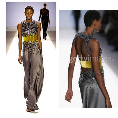 The gold belt brings us full circle -- literally and figuratively to the first dress which has the beading on the bottom half instead of the top. Look below at the first and last dresses:
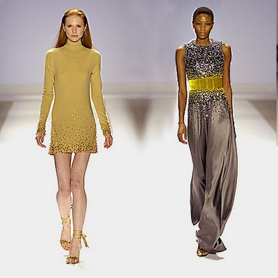
It is like a sun and moon. The symmetry is quite stunning.
Throughout the show there is a sensuality of movement and a play of light and dark created by the fabric choices, the cut, and the beading and other details.
It is a collection that also seems to be symbolic -- bird feathers, lace flowers -- of femininity without being too obvious or stereotypical. I'm not saying this is about some trite narrative about fecundity and birth. I think that might provoke morning sickness in Laura. I just think it is a very sexy and feminine collection that is about a woman being sexy and feminine.
I know I'm waxing bit rhapsodic but the more closely I contemplated these works the more I started to see the collection as moving more towards the world of art in its aesthetic: not just because each piece is so finely wrought but because when brought together they create something that is greater than its parts.




5 comments:
Welcome back Kora!
Laura's was my favorite if only because it seemed like an actual show, the entire presentation was cohesive and together. Love the tune "Laura's Zest" and I hit play when I read yer post.
I really like the way you photoshop some of the looks to explore the themes further.
Thank you for your wonderfully insightful commentary. I loved Laura's collection! I am so very tired of Jeffrey calling Laura's clothes old - women over 25 need to get dressed too! I'd rather be elegant than mutton dressed as lamb or a rock 'n' roll poseur. Your "alterations" were spot-on too!
me too, i admire your analysis--help me see better. i tried photoshopping mutton sleeves in place of the feathers but it was a dismal failure.
Love your blog!
The "foofy stuff" is tulle.
nutmeg
Thanks for sharing the pics.!! Some of those dresses are truly awesome and my favorite too.
Post a Comment