Saturday, March 31, 2007

margaret russell : observation 8

Observations
| 8 |

You need to think about the bigger picture and not get too theoretical. It's not just about the idea of fire or horizon; it's about sleeping in a bed or sitting in a comfortable chair and reading the paper in the morning.

A really well-dressed bed: that's luxury.


earth to andrea

The idea that earth was a difficult element for a hotel room was Completely Bogus. I practically wanted to yell at the television: "Green! Think Green!" And this was what Kelly asked her.

It was such an easy element to be given. Every hotel in the world is doing the California Spa experience with some Japanese touches as well like bamboo, teak and reed. A spa refers to materials like water and marble and sand. It also evokes stone and linen and iris; or jade and silk and orchid.


Frankly, that room Andrea came up with was bizarre.

It was like bad West Elm.

She seemed so stuck on the idea that earth = cruncy granola and folksy plows. To avoid this look she made something very dry and dull. The dimensions were off.

She couldn't break away from her fixed associations and move into ways of imagining that would help her create a room that felt luxurious. There are so many ways to indulge in the idea of sensuality with an element like earth. Rich color is one way.

This is Marimekko (above). Scandinavian designers -- and especially Finnish designers -- have so much life and energy in their nature motifs. Check out Lotta Jansdotter (below) -- she's mainly known for her textiles but her ceramics are also fabulous --

perhaps for a for a breakfast in bed.

There are so many hotels and spas that one could use as examples but one place that came to my mind was Hotel Vitale in San Francisco.

I remembered it as being green but in fact the colors in these pictures are more browns and blues but they couldn't be more different in feel from Andrea's. They are much warmer.


The lobby:


One thing none of the designers provided was a decent workspace:


Here is a great alternative to Andrea's insect-collecting grass tables:


At any rate, everyone today wants the hotel to provide the spa experience and that is very much associated with a kind of natural -- green -- sensibility.

It was driving me nuts to watch Andrea make a room that was so utterly wrong-headed!

Hotel Vitale Press:

burnin' burnin' burnin'

A few observations about Goil and why in the end he just burned out.

1. Crafting


It has occurred to me that Goil basically isn't interested in decorating rooms or designing spaces. What he likes to do is projects. He does crafts.

Goil is a crafter.

I don't mean that pejoratively. Craft is a very diverse and rich area. It can include some silly stuff like painted rocks with googly eyes. But Craft can also be cool. And it includes the kinds of projects that Goil does. And Goil's projects are not necessarily interior design. Not on their own, separate from a good sense of the room as a whole.

2. Limited

The problem with Goil is that he is someone who has only a particular set of skills and they are limited. I say they are limited not because they are not strong skills or difficult or highly technical skills but because he is clearly unable to go beyond them. He painted every single room white. He was told to try certain things but he simply could not break out of his habits of seeing, thinking, acting:
  • white wall
  • light wood floor
  • painted stripes
  • basic primary color
  • project that obsesses him and uses up his time
The good news is that this probably makes him a good architect because he has the exacting qualities of an engineer. Sometimes a person tries something and learns what they don't want to do: I see him as being very frustrated as a designer because he would be trying to do something that is going against his nature. He is someone who works better in the construction and not the decorative areas of design. I can't imagine him working very well with a client because he doesn't seem to listen very well and, for the reasons listed above, he is not very adaptable.

3. Literalism

Part of his limitation is an imaginative limit -- seen in his tendency towards literalism. He doesn't think like an artist. Artists don't think in such concrete terms.

As Margaret pointed out, "fire" and "hotel room" are not the best pairing.


However, he just needed to think about what fire might represent other than fire. Like, say, passion and desire.

In that sense, he had an easy challenge: one of the main reasons people go to hotels is for romantic getaways.

And I'm not talking about heart-shaped beds with a lot of frou-frou rosy decor and bowls of pot-pourri.

three possibilities

Sure, this is armchair designing. but for all the whining we heard I think it is fair for us to say "come on -- how hard is it?"

So here are 3 different style options for a romantic luxury hotel suite. The first two came from a quick google search. The third one is stuff everyone knows : the modern classics.

1. Google search term: Romantic Luxury Hotel
(I looked under Images to find a picture I liked)

Even on a more traditional level there is the simplicity of something like a Spanish style:
Hotel Castillo de Buen Amor, Salamanca, España

And it even has white walls! However the white is has a strong texture (stucco). In this room the dark colors pop: rich stained wood, black marble tile and luscious (buen amor) red.

2. Google search term: Luxury Hotel Thailand

One of the great new hotels of the world, The Rachamankha, owned and designed by Thailand's best architects, provides an excellent example of a hotel that brings together with traditional temple and modern design.


This is not from Rachamankha. It is a detail from a shrine in Thailand. It is so beautiful -- and a symbol of love -- that I decided to post it.

3. modern design classics

Steel frame "Parsons" Bed.
If you are going to have something forged have it be the bed -- that is where the heat is generated. For a more romantic feel you might drape sheers around it.


Modern Sofa
A comfortable couch that two people can sink into and just fall asleep or watch a movie in or just sit and relax and have a glass of champagne. Make sure there is only one cushion across the bottom.


Iconic chair
A bright red sexy sculptural piece of furniture:


Lighting.
Romance is all about the lighting. There is nothing like Fortuny but it may not fit the modern look.

Tube lighting of varying sizes can cast different levels of light and shadow.


Art.
None of this make-your-own crap (I'm talking to you, Kenneth Brown). Get some real art. Don't be asshole decorators : support the local galleries.
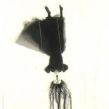
Mari Eastman Dinner Date 2007


Michael Schultheis, Folia of Descartes 06, 2006
Froelick Gallery, Portland, Oregon


Finally, for inspiration, there is one thing that I think of first when I think of fire.

So here's your Fire for you: click and hit play.

Friday, March 30, 2007

emperor of ice

As we know, Matt got the theme of Water.


This was fitting for the blessed one so associated with water, as in turning into wine and walking on (see previous post: why matt can do no wrong regarding who our superstar resembles at times:

Yikes.

Who can compete with that?

Everyone felt that Water was the easiest theme. (Of course the spirit guided the best element to the chosen one.)

These days "spa" and "hotel" are practically interchangeable terms. The colors and surfaces of aqua and teak and sand and surf are ubiquitous in the world of hotels -- making it easier for the designers to come up with ideas at the spur of the moment and to find what they are looking for -- so Water would have been a snap to do as a basic spa type of room.

Furthermore, I remind you that this is taking place in Los Angeles -- a place of surf and sun.

So what does Matt do with it?

He makes ice. Oy.

Jesus wept.


But it was beautiful ice.

It takes someone from a cold climate to create a sparkling icy spectacle under these circumstances.
Feeling Minnesota . . .
Or, maybe it just takes someone from a cold climate to see it this way. (And please pardon my clichés.)
One must have a mind of winter . . .
A number of people noted that it was hard to remember that Matt's room was water and not air
like the blurry winter horizon where snow and sky are indistinguishable.

Other elements included: the very exacting shade of blue
like the particular clarity of the sky on a biting cold, crisp day.

Mirrored tables
like the surface of a skating pond.

Layers of pillows--
like "cotton candy snow" (the name for the snow when it first falls and is downy and soft)
.
The color of the rug

like the dormant grasses that appear in places in the snow drifts.

The glass floor lamp

an icicle reflecting light in its curves.

The mirror -- an icy star.

Andy Goldsworthy, Icicle Star

That said, the room was exquisite but it needed some life. A promise of spring.


Water that moves. Flowers in bloom. Narcissus. Maybe a cherry branch or pussy willows. I like the symbolism of narcissus however. And chocolate is good in the winter as well.

Tuesday, March 27, 2007

observations on observations 1-7

revised (edits) 03/28 9amIt has been a while since I've taken stock of my Top Design literary project: Margaret Russell's Observations. So I've decided to provide a little overview of the "works to date." I've also reprinted the text of the Introduction and the Commentary on Observations #1-3 that I posted previously.

I don't have any general narrative or thematic picture to offer, alas (I know you will be ever so disappointed, gentle reader). Since each week offers up a completely different set of circumstances, I never know what I'm going to use and so I have no plan in mind. It will be interesting (more likely, it won't) to see if the combined sensibilities of Margaret's comments and my fancy will end up producing some motif or sensibility that will make these various entries cohere. (Okay, the unfolding of this literary insight will be about as interesting as watching paint dry.) Stay tuned. (Or not. At any rate, it keeps me amused.)

Click on the titles to go to the individual OBSERVATIONS.

INTRODUCTION
:
One of the main reasons for tuning in to Top Design is to hear what Margaret Russell is going to say. Therefore as regular feature I will be presenting some Margaret Russell's wit and wisdom under a selected edition I haved titled "Observations." The entries will be primarily comprised of epigraphs -- quotations taken from the show. However, I will use my editorial discretion to select the proper form: such as a poem, a koan, a simple statement of design principle, a theatrical note such as an ironic aside, or perhaps some mixed literary-philosophical genre.

OBSERVATION 1

The first week's was a light koan spoken in a more off-hand modern language.

OBSERVATION 2
The second week she again uses the terse declarative statement, but this time it is more poetic, moving into more of a haiku form: her repetition reinforced her characteristic irony, thus the second can be seen as a negation -- or question -- ofthe first. Repetition also insists on further reflection whereupon we might discover that something seemingly simple -- even silly -- may also plumb profound depths.

OBSERVATION 3
Margaret's literary stylings expanded this week in her celebratation of the seaside in southern France. She moved away from the statement form and her language became more associative. I think it was the southern French connection: perhaps she became possessed by the the spirit of the troubadours. Her simple questions -- romantic and almost child-like -- evoke the popular ballad form. The poem appears to be an aubade that celebrates the morning light.The aubade was popular with both the troubadors and as well as modernist poets such as Ezra Pound who greatly admired the troubadors. The second stanza's classic imagist style is very reminiscent of H.D. Indeed, her intense compaction and ironic undercurrent perfectly captures the spirit of the Americans in France a century ago. Can we read this as Margaret's preference for the modern over the of French country decor?

OBSERVATION #4
This is comprised of a series of three statements, each one a different type of address that moves from distance inward. The first is what we have come to know as her forte, i.e., the declarative statement (usually the pronouncement of a rule); the second is a more personal, conversational line addressed to "you"; and the third seems confessional and private as if spoken only to herself.

OBSERVATION #5
This observation was Margaret's challenge to Kelly, but really it is addressed to all of us. Margaret isn't just warning against being charmed by fakers who have nothing to back up their talk; she is demanding that we take art seriously. We must question its claims and explore its meanings. Art is where we engage with "big ideas."

OBSERVATION #6
This consists of four short poems that are typical "Margaretisms." I decided to break them into separate sections and add line breaks in order to emphasize the different ways that she uses language that can be seen as employing literary techniques:
  1. The first one is a list. What interested me was the richness of the language luxury as it builds up in her list of the extravagant celebrations of the super-rich. The language itself seems to participate in the enjoyment of excess.
  2. The second could be seen as using pacing and inflection to mimic meaning but mainly I just like the line.
  3. The third is syllabic (count'em).
  4. The last one, especially taken out of context, becomes is a wonderful pair of absurd contradictions -- like something out of Alice in Wonderland.
OBSERVATION #7
We return to the haiku: these two are in the classic seventeen syllable form.

margaret russell : observation 7

Observations
| 7 |

the olive branch
on the top of the sideboard

was a poetic touch


although polished
and ready for guests,
the room
was cautious and quiet