Saturday, September 23, 2006

harem pants

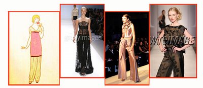
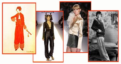
In 1909 Paris was gripped with a passion for "orientalism"--a style that was in fashion due in large part to the arrival of the Ballet Russe. In the same year the innovative fashion designer Paul Poiret--who had already produced fashions that evoked Eastern styles of dress--and introduced "harem pants," which became one of his signature pieces.

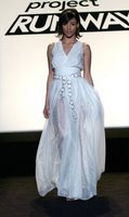
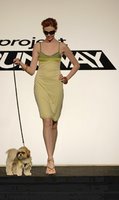
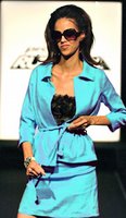
Above: Paul Poiret, Laura Bennett, Laura Bennet,
and a photograph of Louise Brooks
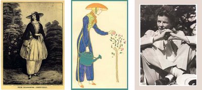
Below: Paul Poiret, Laura Bennet, Malan Breton,
Malan Breton

Harem pants became a signature style of the modern "new woman" and were worn by Hollywood "flapper" icons such as Louise Brooks (photos above: top row, far right).

This effort to put women into trousers was more successful than "bloomers" (named after the early feminist Amelia Bloomer [below, left]) which were part of the nineteenth century dress reform movement.
Harem pants were less like underwear than bloomers but more like lounge- or leisure-wear than the tailored trousers donned by Katherine Hepburn and other women in the 1930s and 40s.

further information:

Friday, September 22, 2006

flappers, follies & feathers 1 : contexts

early 20th century fashion on today's runway

some history : arts | fashion
These posts are still in need of some tweaking and editing but the basic information is now up. To check these out as separate pages click on the individual topics or just click arts | fashion and read them all at once.

    Monday, September 18, 2006

    josephine baker

    now up:
    • josephine baker (1906 - 1975) : American born; naturalized French citizen: a performer best known for starring roles at the Folies-Bergère and Ziegfeld Follies in the 1920s and 1930s. She performed in floor shows, revues, operettas, and films as a singer as a comedienne, actress, and, especially, as a dancer. She is best known for two of her exotic dances: her "jungle" dance where she wore nothing but a string of bananas around her waist and another where she wore only a skirt of feathers entitled 'La Danse de Sauvage' but was actually the Charleston . . . click here for a longer biographical sketch.
    coming soon:
    • josephine baker & project runway designers

    stuck in the past

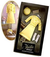
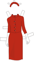
    is it impossible to update jackie o?

    While I'm on the topic of updating the look of fashion icons, I want to return to the Iconic Statement challenge.

    It seems like definition of Jackie O's style is limited to a few years of her life. Ironically it is the period when she did not have the"O".


    Even when she was alive she was fixed in the past for the sake of American's nostalgia for "Camelot."

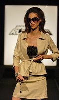
    The challenge in "Iconic Statement" (Episode 5) was for the designers was to "update" the look of a fashion icon and not to make a replica costume.


    But is it possible that the judges may not have been open to the idea of updating this icon? If they can't allow her to move her out of the '60s then how can they request that her look be updated to the present time.

    One complaint the judges had about Robert's suit was that it wasn't tailored enough. They insisted that Jackie O never wore anything that wasn't highly structured.

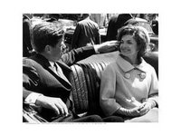
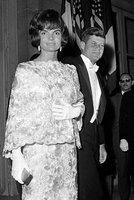
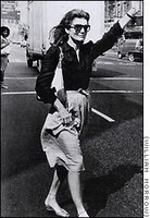
    Here (right) is a photograph of Jackie O dressed in looser style clothes than the box suit that she made famous in the sixties.

    And, lest we forget, her designer was Oleg Cassini after all. What about a track suit??!!


    Here are two runway approaches that we can compare to Robert's attempt to update the Jackie O look.

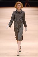
    In Fall 2005 Alexander McQueen used Jackie O as his inspiration. The look he created (right) is a costume, right down to the hair and the white gloves. There's no updating it is primarily a recreation of a look. It is an appealing look but this is not especially innovative design work.


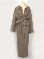
    On the other hand, this Chanel 1998 suit ( right) is a much more unstructured version of the structured, boxy, tailoring we associate with the Chanel suit. It isn't specifically addressing the Jackie O look but the endeavor is similar.

    Considered in this light, Robert's updated Jackie O suit doesn't seem so off-base.

    At least it wasn't deserving of the outrage heaped upon him for being so off-base.

    Robert's biggest error was in taking fabric from Vincent (what was he thinking??!!!).

    His first choice of Tiffany blue fabric was lovely and if he'd stuck with this his suit would have looked more youthful and made more of an impression.

    Robert didn't lose this episode but it was the one when the judges really turned against him. This was the episode when Bradley was auffed -- and appropriately so. The poor guy didn't have a clue about Cher and what he made was ridiculous.


    Oh, and -- following up on my repeat offenders post, what did Vincent do for that challenge?

    Update Twiggy.

    Right. That look is spot-on --

    if Twiggy wore halloween-themed apron projects from the country crafty shoppe.

    No wonder he talked about her as if he thought she was dead. She wouldn't have been caught dead in something like that.

    coming soon . . .

    ? ? ? ? ? ? ? ? ? ? ? ? ? ? ? ? ? ? ? ?

    Who was Josephine Baker

    and how and why is she inspiring

    the collections of current runway

    designers (e.g., Laura and Malan)

    ? ? ? ? ? ? ? ? ? ? ? ? ? ? ? ? ? ? ? ?

    repeat offenders

    or, getting the old in and out

    The producers' defense of the episode 10 gimmick is that they didn't know ahead of time that the two returning designers would turn out to be the two most annoying (read Andy's Blog). On the other hand, it is easy to assume that the two returning designers would be those who were most recently kicked out. Presumably they would be the next best designers. Of course they were not the best designers because the producers wanted to keep around the nut cases for "drama."

    Vincent and Angela's return was pointless. Everyone knew that neither one of them would win. It was also annoying. They had already overstayed their welcome. We'd finally gotten rid of them and no one--least of all the viewers--wanted to see them darken the door of Parsons and the Atlas again.

    I don't say this with malice: Angela seems like a fine person who is open minded but sticks to her own fleurchon-festooned jubilee jumbles creative vision. She has been amusing and baffling to viewers but in the end she proved to be a remarkably generous-spirited person. And she lives her life in keeping with values that are very admirable. It is too bad she is lumped together with Vincent who is truly disturbed and evokes in viewers a mix of loathing and pity. (See also "for the record.")

    My point is that by the 10th episode we'd seen what they could do -- they'd had more than their fare share of chances and of lucky breaks.

    Anyway, it seems like in order to be "fair" they set up a criteria that lacked the flexibility they needed to have the episode make any sense at all. And I'm not sure how fair they were either.

    Just for the hell of it, here are a few of the other ways they could have approached this challenge.


    THE FIRST TO GO: STACY, MALAN, KATY (KATHERINE)

    Why not just pick those designers we haven't recently seen?
    The ones who had the least chance to show what they could do?
    The ones who didn't get the benefit of the doubt?

    This also deals with the "Keith Factor" : that is, the three designers who were kicked off before Keith during the period when he was violating the rules.

    (This is particularly an issue for Katy.)
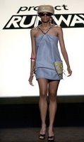

    STACY

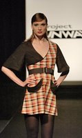
    Look at the two outfits to the right and you tell me which one is insanely hideous?

    Enough said.

    Think of all the trouble wrought by this first of a series of bad decisions.

    What ever happend to the old chestnut "we're concerned about taste level"???


    MALAN

    Malan made the fatal error of not buying enough fabric and his gown was too short.

    His dress was flawed but it was also ambitious, as opposed to a basic sheath with minimal fitting and even that was done badly. It also did not have ridiculous shoulder wings. Nor did it look like a bad prom dress project from the early eighties.

    He also demonstrated that he could work collaboratively and be a team leader: it was not "the biggest nightmare of [his] life".

    He also is a quirky personality who could have provided the show with a great deal of drama and personal interest and hilarity. He's odd but not creepy. Or certifiable.

    Malan is a talented and experienced designer who very conceivably could have made it to the final 3. He didn't but he didn't need to. He landed on the runway at Fashion Week anyway.


    KATY

    There is also the matter of Katherine. In the episode when she was auffed it came down to a choice between her and Keith. Keith was soon asked to leave for violating the rules.

    As it happens another set of rules that Keith felt did not apply to him were the requirements for the designers that week. Katherine did.

    Her dress was considered too simple.

    I thought it was adorable.
    it was one of my favorite designs of this season in terms of something I would buy for myself to wear. (I want one in every color!).

    She didn't have time to make the hoodie but she showed a "sample" on the dog which was a cute and funny solution to the problem. And it was adorable.

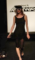
    But there was another dress on the runway that was even simpler and lacked any style whatsoever and a major part of the look was leggings that the designer didn't make. The look was then topped off by a beret and sunglasses that just screamed 1983.

    You could put together a whole group of people who were kicked off when Vincent should have been. That would be a solid group of designers!


    ROBERT

    The criteria for who was chosen to return wasn't even consistent. If Angela could get another chance then why not Robert who also worked on a winning team?

    Perhaps Robert wouldn't have won without Kayne but it is also clear that Angela would not have won without the help of Laura and Michael.

    I'd also like to point out that Robert's design for Jackie O -- for which he took so much heat -- is really not so off base as everyone seemed to think.

    Click here for more.


    ALISON

    Alison was the viewers choice for who to bring back. She had the most controversial "auffing." There is little question that she was one of the most talented and promising of all the designers.

    If they wanted to scare the bejesus out of the remaining designers they should have brought back Malan and Alison.

    Perhaps the criteria could have been to bring back the two designers who clearly had the talent and skill to be in the final three but they were cut before they had a chance to really show themselves.

    In both cases they were also cut instead of Vincent and Angela -- choices that were debatable if not completely wrong-headed.

    NOBODY - or - AVOIDING THE SHARK

    The problem with these sorts of gimmicks is that they look desperate and run the risk of being a "jumping the shark" moment. This whole season may turn out to be the "jump the shark" year, given that it is when PR moved from being different from other reality shows to being just like them : focused on annoying dysfunctional people bickering and sniping. One might even say that the decision to have someone like Vincent on the show was a shark jump in and of itself.

    One shark jump rule might be that it a reality show has jumped the shark when it reaches down to the ethical dregs and casts a person who is seriously in need of medical attention for psychotic symptoms: e.g., hearing voices, manic activity that includes comments -- or worse -- that are sexually inappropriate, and possessing delusional, exaggerated and paranoidal beliefs that are profoundly and visibly incommesurate with reality.

    Just a thought.
    mug shot chic

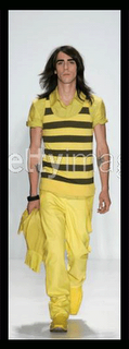
    Can someone please explain to me why the latest style for men is the "police lineup" ? ? ?
    This look includes long, greasy hair, an unshaven face, and generally resembling the ex-con that just got fired from Jiffy Lube because he repeatedly came to work late and hungover.

    Sunday, September 17, 2006

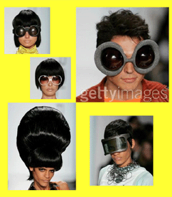
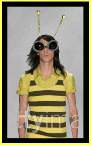
    jay mccarroll unveils latest fashion trends for red carpet trick-or-treaters

    Oh my.

    Somebody has spent a little too much time getting high and watching Nickelodeon.

    And it doesn't help that the models all have that "I'm deep / who farted" look on their faces. Like if they appeared deadly serious this would make us forget the fact that they looked like cartoons.
    The welder's mask? All I can think of is Flashdance.

    ---------------------------------------------
    I guess it is just that time of year.

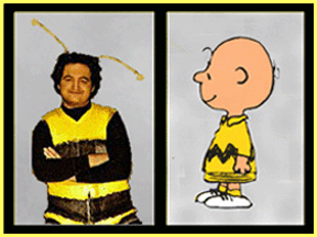
    That is, the time of year to put together these sorts of outfits:

    But it needs more -- there's something missing . . .

    That's it. Now no one will ask him "what are you supposed to be?" when he shows up at the door with his trick-or-treat bag.

    That is where he's supposed to be going, right?

    But he wouldn't want to go alone.


    And, of course, it's always fun to dress up the dog for Halloween.


    --------------------------------------------------

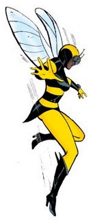
    Okay. Just because comic books are all the rage doesn't necessarily mean that they can be translated literally into high fashion.


    Perhaps Jay McC thought this collection was hipster-manga but it is more like a grade school halloween party: cute, very silly and there's always a few cases that are little sad. And after all the indulgence everyone feels a bit quesy.


    -----------------------------------------
    a quiz:
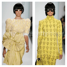
    are the two outfits below from the 2006 runway or . . .

    . . . are they an Easter dress and pajamas from the girls section of the 1972 Sears Catalogue?
    -------------------------------------------------------------

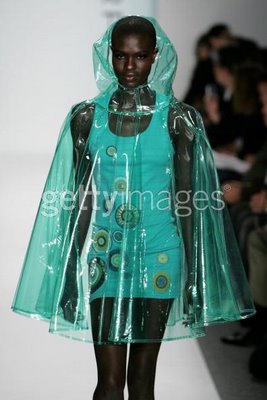
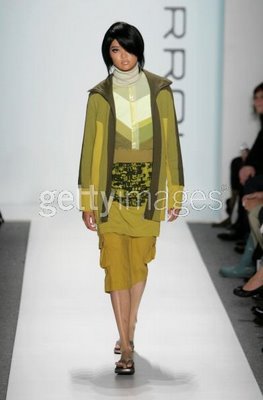
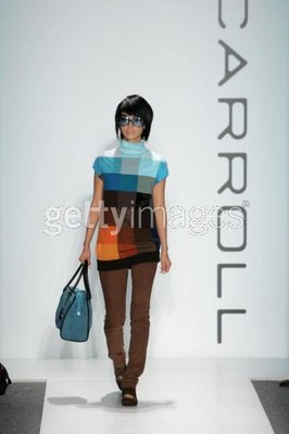
    It is unfortunate that the cartoonish hair and glasses just detracts from the fashions. Some of them are very appealing. There are designs in this collection that I think are wonderful. Here are three:


    In the first photo you can see that with the right model the clothes convey an updated mod look that is both global and out-of-this-world. The image is gorgeous.


    The second look is mod (with colors that evoke the seventies) updated to contemporary street-inspired sportswear.


    The third is more of a 60' mod look but it doesn't look dated -- like one is dressing up and going to a 60s theme party -- and the palette of blue and brown is very current.


    All three of these fashions are exciting -- although I can't see myself wearing the first as a dress -- I'd wear it as a top.


    The second and third looks are the kinds of clothes that I'd live in.


    I admire JMcC's support for animal causes and especially his vocal position against the fur industry. He's a talented designer who deserves all of the good reviews he is getting. But I also feel like there is a bit of the "Emperor's New Clothes" syndrome. People who watch PR are too fond of him to evaluate his fashions critically.

    No one wants to say, "what the bloody buggery bullocks is this?"

    Maybe they think that if they say it looks stupid people will think they just "don't get it." You know: "It's an artistic statement, you rube!"

    But the silly hats and glasses and hair seems more desperate than daring. It strikes me as a sophomoric attempt at trying to be outrageous. Like people aren't going to pay attention to him (!). He doesn't need to do this. His clothes are fabulous. He should let them stand -- or strut -- for themselves and not distract us with gimmicks.

    In the fashion world there is a sense that it isn't "high fashion" if the clothes are too appealing and wearable. Perhaps JMcC did this to make his work seem more avant-garde. He has said that this collection was inspired by Archigram. It sounds interesting although the jewellery and air balloon prints didn't really excite me. It seems to me that his best work has more in common with Futurism, the avant-garde movement that was a more significant precurser to -- and inspiration for Archigram. Futurism had a more exciting aesthetic in all areas of art and design, including some very innovative fashion.

    Sketch for a man's waistcoat. Giacomo Balla. 1930.