
Three little birds, sat on my window.
And they told me I don't need to worry.--- Put Your Records On | Corinne Bailey Rae
currently playing on Michael's My Space
I thought Michael's room was great.

His client was lucky that to have a designer who could create a room that was better than they knew how to describe. A graduating design student should have aspired to live in this kind of a space. Michael's taste and style was sophisticated but it wasn't old. There were a few problems : it needed a coffee table and as Linda Merrill pointed out, too much furniture was clustered at the back of the room leaving it feeling empty up in front. Nonetheless this was mid-century modern (up to seventies Scandinavian design) but in an unpredictable and quirky enough way so that it wasn't too obvious or theme-y. The art on the back wall was nice but I'm just going to address the confusion that the judges had with the three birds on the side wall.
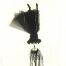
Margaret: And those ducks?
Jonathan: I don't know what was up with them birds on the wall.
-- re: Michael's room from Margaret & Jonathan's blogs on bravotv.com
Let's start at the beginning with what was probably, for anyone between the ages of 10 and 70, the obvious association:
 Created by Sandy Dvore the Partridge Family logo and hatching egg opening title sequence is a brilliant work of graphic design and one of the most iconic images from television.Furthermore, this image is inseparable from the television show's theme song "C'mon Get Happy." (See also Top Design Blogger's "Michael Made Us All Sing" posting.)
Isn't that Jonathan Adler's mantra? He sure wasn't giving Michael any of it.
This kind of graphic imagery is still popular. Sometimes it is explicitly referencing the Partridge Family logo:

 Luba
Lubaerinzam.etsy.com
These basic cutouts are, of course, commonly seen in the simple shapes used in children's illustration or by crafters who work with materials such as paper cutout:
 love
loverachel herbert

I am fairly certain that Michael would be familiar with the work of Charley Harper, an artist whom Todd Oldham champions. It is possible that the bold graphic shape and lines of Harper's birds may be another source of inspiration.
 cardinal courtship
charley harper
 cardinal courtship
charley harper
snow goose gallery
While I can't really claim that three wood cutouts are explicitly related to any of these various artistic forms, I do think that the shape was modern and bold enough to suggest an awareness of a particular graphic look.
At any rate, my simple answer to Margaret and Jonathan is that with "them birds" Michael is using a popular style of graphic imagery -- simple, folk, craftsy, a bit cutesy but also funky and retro -- that has pop culture associations connected to the message of being happy and being yourself.


6 comments:
I loved Michael's room!
I thought Michaels' was one of the best as well. Not sure why the judges (or editors) put sooo much focus on color. It's important - but enough to trump function and execution?
Your avian dissertation is great - although I'd still maintain that the cutout birds were just a little off.
I'm so glad to hear that others liked Michael's room. I thought it was original and cohesive, and stood out for being hip and modern.
As for the colors, don't these judges ever visit the apartments and houses of today's 20 somethings? For that age group, those colors DO symbolize happy.
I also loved Michael's room. They are ridiculous....they had to have been living in a fallout shelter not to have recognized the partridges. Come on, get happy!
Interesting that you mention Charley Harper. I had not thought of that allusion before you mentioned it. I did, however, have the opportunity to see an exhibit of Harper’s work at Cincinnati’s Contemporary Arts Center before it closed today. The installation and graphic identify for the exhibit were designed by Todd Oldham. You can see a glimpse of it at http://www.contemporaryartscenter.org/. The ladybug on the far wall is one of Charley Harper’s iconic designs. I believe the couches in the lower right corner of the photo were designed by Todd Oldham. The fabric in which they are upholstered is based on one of Charley Harper’s designs, which is incorporated strictly through texture rather than color. Alas, I could not get the link to Todd’s podcast to work.
Editor Girl
I'm not sure why the judges didn't get that the cutout birds were a continuation of the birds on the art on the back wall. I thought it tied together pretty well.
Post a Comment